Wednesday, October 24, 2012

DePuy Questionnaire

We decided we needed more information about the factory, what it looks like, how many machines they have, floor plans, their energy usage etc. We wanted to send a questionnaire to the factory and decided to seperate it into different topics of questions, we chose these topics:
  • General
  • Communication
  • Training
  • Maintenance and Repair
  • Monitoring and Control
So we done a brainstorming exercise in class to come with questions for each topic and here are the images showing our outcome:


After collecting all the questions we filtered through them to decide which were the most important for the questionnaire. Here is the finished questionnaire that was sent to the factory:


DePuy Live Project

Research on factory line infographics

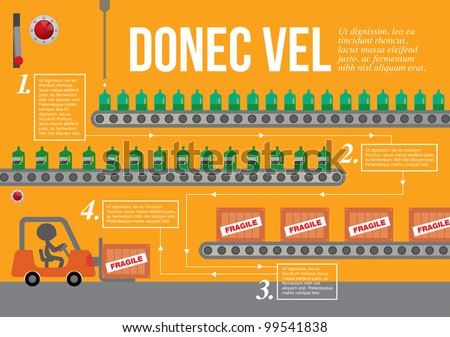
These infographics don't necessarily relate to how machines operate in a factory but I'm looking out for factory production line graphics. Here are some good examples of that:

stock vector : Set of factory infographics, factory info graphics vector illustrator
 
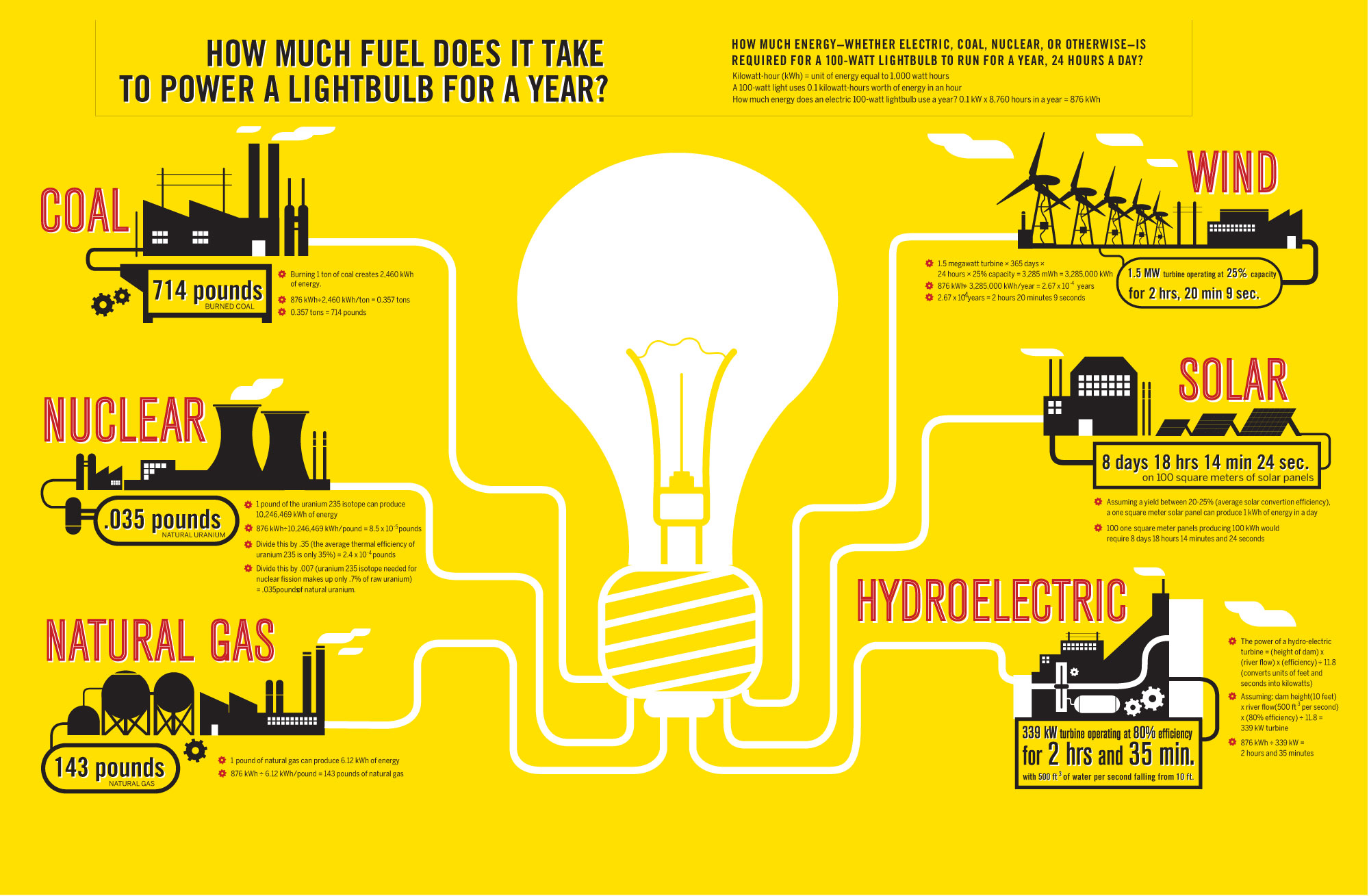
Here are some examples of energy infographics, these could be used to show how much energy each machine was using in production or how much energy is wasted when they are on standby. It could also be used to show the amount of water, air, electricity and Co2 levels used or wasted by machines.
 
 
stock vector : abstract factory info graphic elements, vector background
 
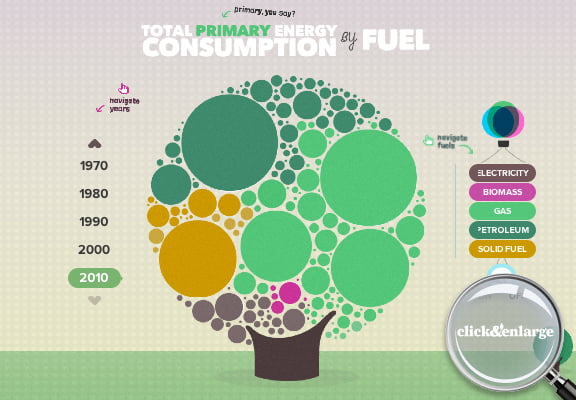
Here are some infographics with good use of colour to show information. When the viewer knows what each colour stands for it is a quick an easy way of getting information.
 
stock vector : Premium infographics master collection: graphs, histograms, arrows, chart, 3D globe, icons and a lot of related design elements.


Tuesday, October 16, 2012

Touched up James Bond infographic

My previous infographic had alot of stuff that were not needed at all, I just simplified it down totally. I removed the background and I removed the ledgend. I also took away all the wacky colours and just left three, red, black and white. I then incorporated the Bond names into the ring lines on the shooting target and added the number of kills to each ring. I removed the bullet holes aswell as they weren't useful in showing any information at all. I also made the whole target bigger to fit the page properly and added a better title. Personally I think this simplier version is alot better than my previous one.

Sunday, October 14, 2012

My real life infographic

I decided to use food for my topic and I made an infographic using eggs. I used a boiled egg, scrambled egg and a fried egg for my image and then added the percentages of how many people prefer which type for their breakfast. I wanted a catchy title so I used the well known phrase 'How do you like your eggs in the morning?'

Wednesday, October 10, 2012

Real life infographic

For this project we have to make up our own real life infographic. We can take a photograph of it and then take it into Photoshop and add text or colour overlays.
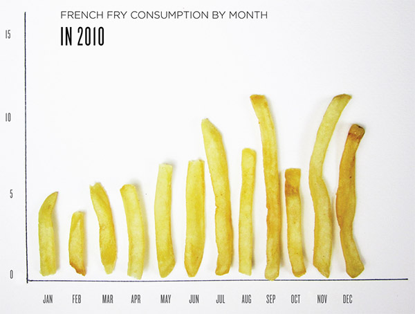
Here are some real life infographics I have found interesting.


Monday, October 8, 2012

The James Bond Challenge

For the James Bond Challenge we were giving a load of facts about all the James Bond Movies, We then had to display the information through a graphic image. It makes the information come across clearer to the viewer rather than looking at a page full of numbers. I had a few ideas which I will upload later but for now this is the one I decided to bring to the computer and work on more.

This inforgraphic shows the total number of kills made by all bonds throughout the years, the colour of the bullet hole beside each name coresponds to the colour of each ring on the target. Each number inside the ring tells how many kills were made by that bond.