http://prezi.com/cazdoqqxuanf/depuy-infographic-concepts/
Ok so after reading through the information DePuy gave us I moved off the idea of doing an annual report infographic and moved towards the idea of doing an infographic to help monitor their machines.
DePuy said it would be useful if each machine had a target to achieve. They do monitor the machines throughout their lifecycle so they know roughly how many products the machine produces or works on. If there was an easier way for them to monitor the machine's use of electricity and water etc and also to monitor the output of the machines as in the number of products or gas emissions then they would be able to tell when a machine is nearing the end of its life.
Here are the three infographics I based my idea around and also the sketches of my three concept ideas:
This first one has the machine in the middle and all the components that need to be monitored create two semi-circles along the top and bottom. Don't know why my concept came in horizontal but I can't change it!

Each icon represents a different element to be monitored. Water, Electricity, CO2 emissions, When it was last serviced or due a service, the target the machine is to reach and how many hours it has been operationg for. It would be an interactive infographic, once the icon is rolled over it would show the information in a box beside the icon.
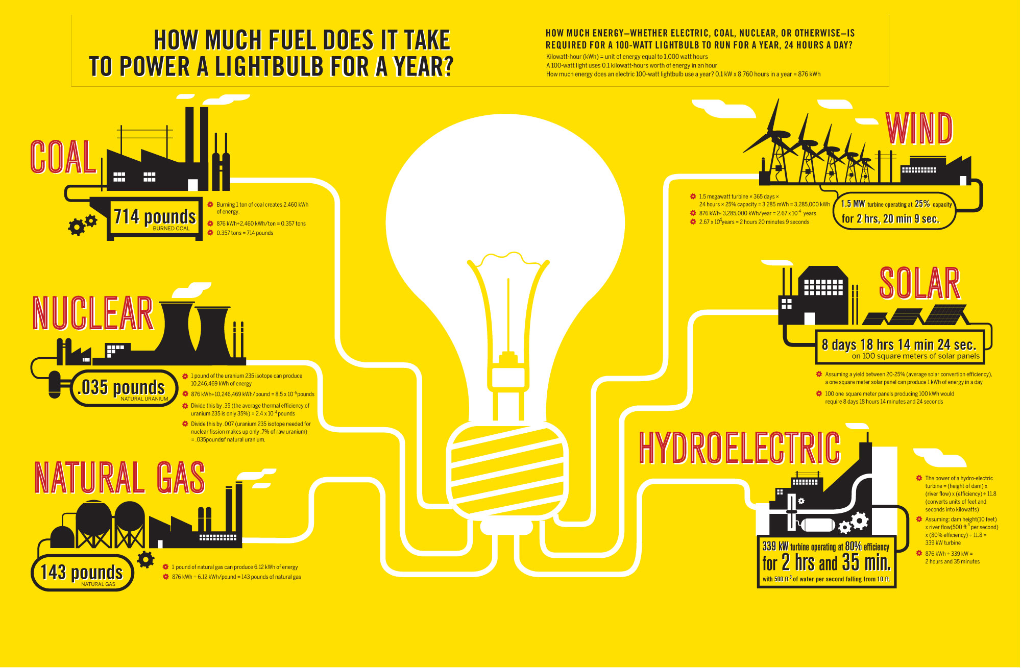
My second concept comes from this infographic below, the machine is in the middle again but the icons are arranged differently. The icons on the left of the machine are the elements that go into the machine or are used to operate it and the icons on the right show what comes out of the machine or how well it operates.

Again this is an interactive infographic and once the icons are rolled over the information appears in a seperate box.
Once I had looked at these two concepts I realised there would be alot of infographics for each machine so I came up with a more efficient way to show the information. Here below I put the two ideas together and came up with a kind of floor plan to show each machine on the production line. This would be interactive also and when you rolled over a particular machine a box would pop up in its place with all the information in one place.

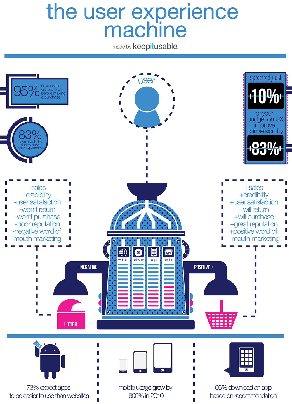
My final concept was based around different colours to show different information about the machine. I got the idea from this infographic below.


Again this is an interactive infographic, the blue colour represents water, the grey is CO2 emissions and the yellow is electricity. The amounts coloured in on the machine represents how much of each the machine uses or outputs. Once each colour would be rolled over the exact figure for that element would appear e.g 600kw on the yellow area. I then added the other icons on the right side, the figures could be left beside the icon and for the target and hours icon the number would just increase automatically. Another option would be to take away the information and just leave the icon on its own, once rolled over the information would then appear.
No comments:
Post a Comment