Saturday, December 22, 2012

Developing my infographics

Here is a storyboard I drew out to show how my interactive infographic would work:

 
Here is my drawing for an idea of a static infographic for the annual report:
 
 
After my chat with Terry in class we decided that I should design 3 static infographics to show how they could be used as an interactive infographic. Here are some sketch ideas I done to show how the first screen could look. This would show each line of machines on the factory floor, for overall monitoring. It would be designed for wide screen 1024 x 768 and could be accessed by anyone that would be authorised to monitor.


Here are some ideas that follow on from the 4 options previous. This would be the second screen which would show each machine on the specific line that was chosen. Show its number and model. 
 
 
I started working on my idea in Photoshop, I started by making out a grid that I was going to follow for each screen so they would all be layed out the same and have a nice flow to them.


After working on screen 1 and screen 2 here were the outcomes I came up with:


I showed my idea to Fergus and Terry in class and I received some good feedback, Fergus wanted me to turn my 2D infographics into 3D versions. He suggested that I have flat green machines if everything was running well and then to raise the machine and turn it red to show when there was a problem. Terry showed me how to do a 3D Extrude in Illustrator so I started working on that and here is the outcome:
 

I wasn't happy with the layout of these infographics though as they looked a bit off on the perspective side of things. After showing them to Terry he suggested that I use the Isometric option in Illustrator to keep everything running with the same pattern. He also suggested that I add in my orange machine also to show when a machine is nearing a service and not running as well as it should be. I decided to keep the machines all the same height as seeing that one was a different colour stood out well enough to point out a problem to the viewer. Here are some screenshots of my developing work:


And here are the two outcomes for both screen 1 and screen 2:


Ok so that's the 2 more basic screens done. Now its onto the last screen which will be the most detailed inforgraphic. Here were some sketch ideas I came up with for this one:
 
 
After choosing an idea I started developing it in Illustrator, keeping everything lined up with a grid and sticking with the Isometric theme throughout:
 
 
I did use the Isometric effect for the information beside each icon but it wasn't very ligible so I had to leave it straight instead. Here is my outcome for screen 3:
 
 
I wanted to make screen 3 able for a static infographic that could be used for the annual report, so here it is. This represents one machine:
 
 
A document such as the one below could then be made with the information of each machine on each line. The one below represents one lin of machines:
 
 
I wanted to make a video to show how the interactive infograph would work, so I started by sketching out a storyboard to help me plan the video out.


Here is the video I made for my presentation in class, it shows how my 3 infographic screens can come together to make an interactive infographic.
 
 
After showing my work in class, the Depuy men suggested I spaced out the product lines more on my first infographic and also told me to space out the machines more on the second infographic. Terry also told me I needed a navigation bar on the infographics so the operator would know what section they were in. So I took this advice on board and here are the outcomes:  


I also updated my video with these changes:


Sunday, November 11, 2012

3 Concept ideas

Here is my prezi presentation on my concepts:
http://prezi.com/cazdoqqxuanf/depuy-infographic-concepts/

Ok so after reading through the information DePuy gave us I moved off the idea of doing an annual report infographic and moved towards the idea of doing an infographic to help monitor their machines.
DePuy said it would be useful if each machine had a target to achieve. They do monitor the machines throughout their lifecycle so they know roughly how many products the machine produces or works on. If there was an easier way for them to monitor the machine's use of electricity and water etc and also to monitor the output of the machines as in the number of products or gas emissions then they would be able to tell when a machine is nearing the end of its life.
Here are the three infographics I based my idea around and also the sketches of my three concept ideas:

This first one has the machine in the middle and all the components that need to be monitored create two semi-circles along the top and bottom. Don't know why my concept came in horizontal but I can't change it!


Each icon represents a different element to be monitored. Water, Electricity, CO2 emissions, When it was last serviced or due a service, the target the machine is to reach and how many hours it has been operationg for. It would be an interactive infographic, once the icon is rolled over it would show the information in a box beside the icon.
 
My second concept comes from this infographic below, the machine is in the middle again but the icons are arranged differently. The icons on the left of the machine are the elements that go into the machine or are used to operate it and the icons on the right show what comes out of the machine or how well it operates. 


Again this is an interactive infographic and once the icons are rolled over the information appears in a seperate box.
 
Once I had looked at these two concepts I realised there would be alot of infographics for each machine so I came up with a more efficient way to show the information. Here below I put the two ideas together and came up with a kind of floor plan to show each machine on the production line. This would be interactive also and when you rolled over a particular machine a box would pop up in its place with all the information in one place.

 
My final concept was based around different colours to show different information about the machine. I got the idea from this infographic below.


Again this is an interactive infographic, the blue colour represents water, the grey is CO2 emissions and the yellow is electricity. The amounts coloured in on the machine represents how much of each the machine uses or outputs. Once each colour would be rolled over the exact figure for that element would appear e.g 600kw on the yellow area. I then added the other icons on the right side, the figures could be left beside the icon and for the target and hours icon the number would just increase automatically. Another option would be to take away the information and just leave the icon on its own, once rolled over the information would then appear.
 

Research on Annual Report Infographics

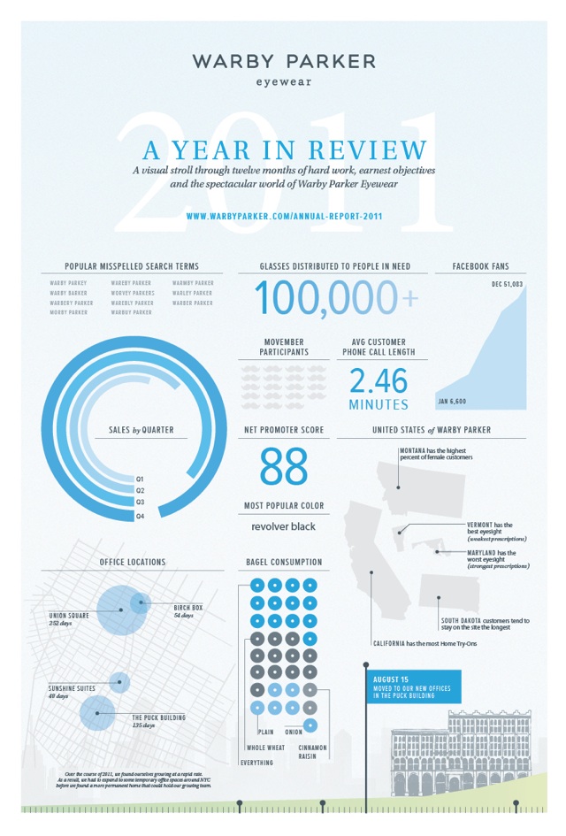
I liked the idea of doing an Annual Report Infographic for DePuy, mostly focusing on the financial side of the company to give information such as:
  • How well is the company doing?
  • Are earnings higher or lower than last year?
  • Is the company making more money than it is spending?
  • Are assets higher or lower than last year?
I then went and had a look at some annual report infographics I found online.
Pinned Image
 
Pinned Image


Wednesday, October 24, 2012

DePuy Questionnaire

We decided we needed more information about the factory, what it looks like, how many machines they have, floor plans, their energy usage etc. We wanted to send a questionnaire to the factory and decided to seperate it into different topics of questions, we chose these topics:
  • General
  • Communication
  • Training
  • Maintenance and Repair
  • Monitoring and Control
So we done a brainstorming exercise in class to come with questions for each topic and here are the images showing our outcome:


After collecting all the questions we filtered through them to decide which were the most important for the questionnaire. Here is the finished questionnaire that was sent to the factory:


DePuy Live Project

Research on factory line infographics

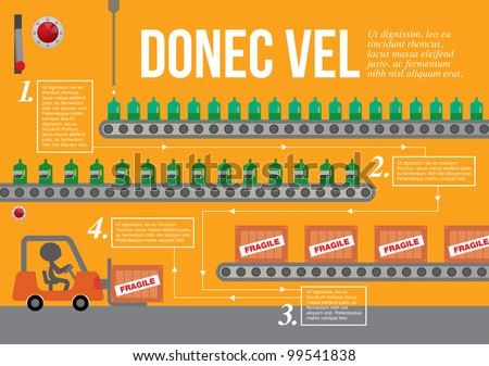
These infographics don't necessarily relate to how machines operate in a factory but I'm looking out for factory production line graphics. Here are some good examples of that:

stock vector : Set of factory infographics, factory info graphics vector illustrator
 
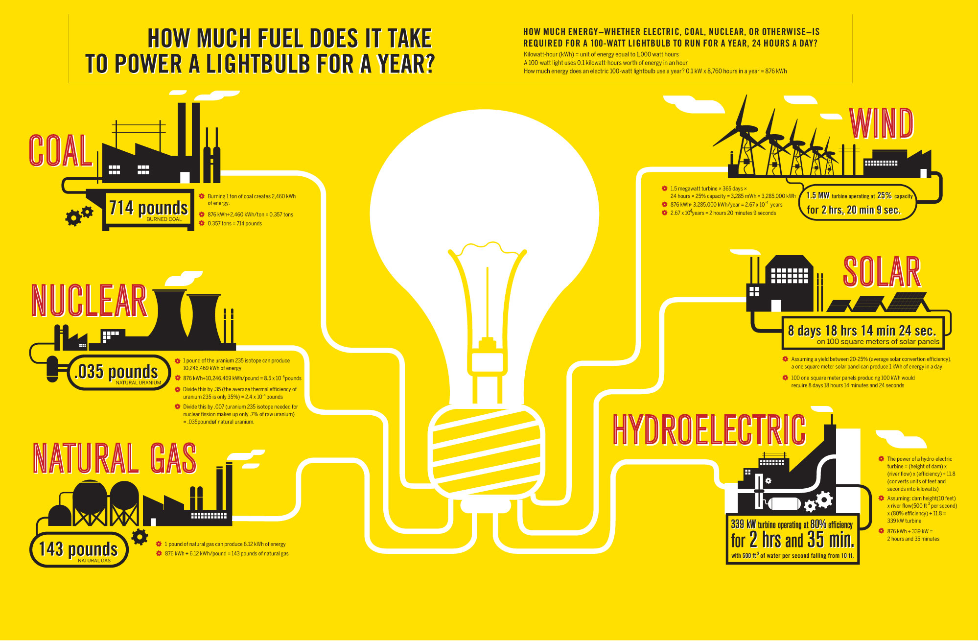
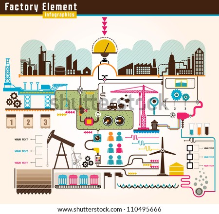
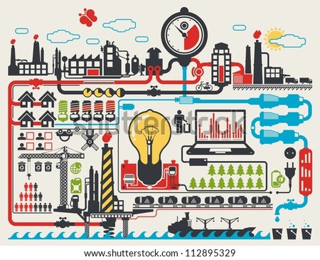
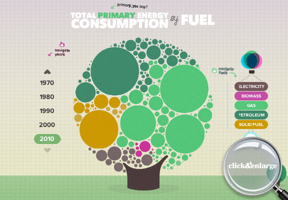
Here are some examples of energy infographics, these could be used to show how much energy each machine was using in production or how much energy is wasted when they are on standby. It could also be used to show the amount of water, air, electricity and Co2 levels used or wasted by machines.
 
 
stock vector : abstract factory info graphic elements, vector background
 
Here are some infographics with good use of colour to show information. When the viewer knows what each colour stands for it is a quick an easy way of getting information.
 
stock vector : Premium infographics master collection: graphs, histograms, arrows, chart, 3D globe, icons and a lot of related design elements.